Components
Utilities
Fonts
Components
Utilities
Fonts
Font metrics
Fonts in web development, has always been a huge problem.
They never render exactly the way you want it to and are not displayed the same from a browser to another, or even from an OS to another.
But why is that?
For you to understand the problem, you need to understand how fonts are displayed on a page:
Let’s say that on your page, you decide to use the bagerish font (the one that we use here on titles).
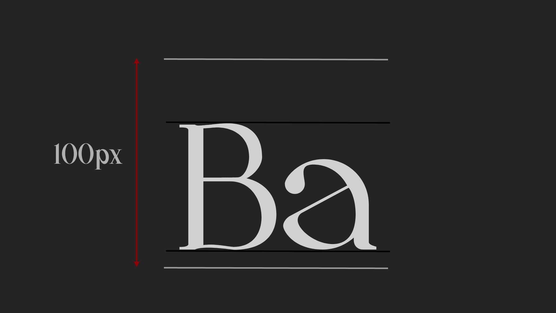
And now let's say that you define its size to be a 100px (assuming that in this case you are no using NimbusCss).
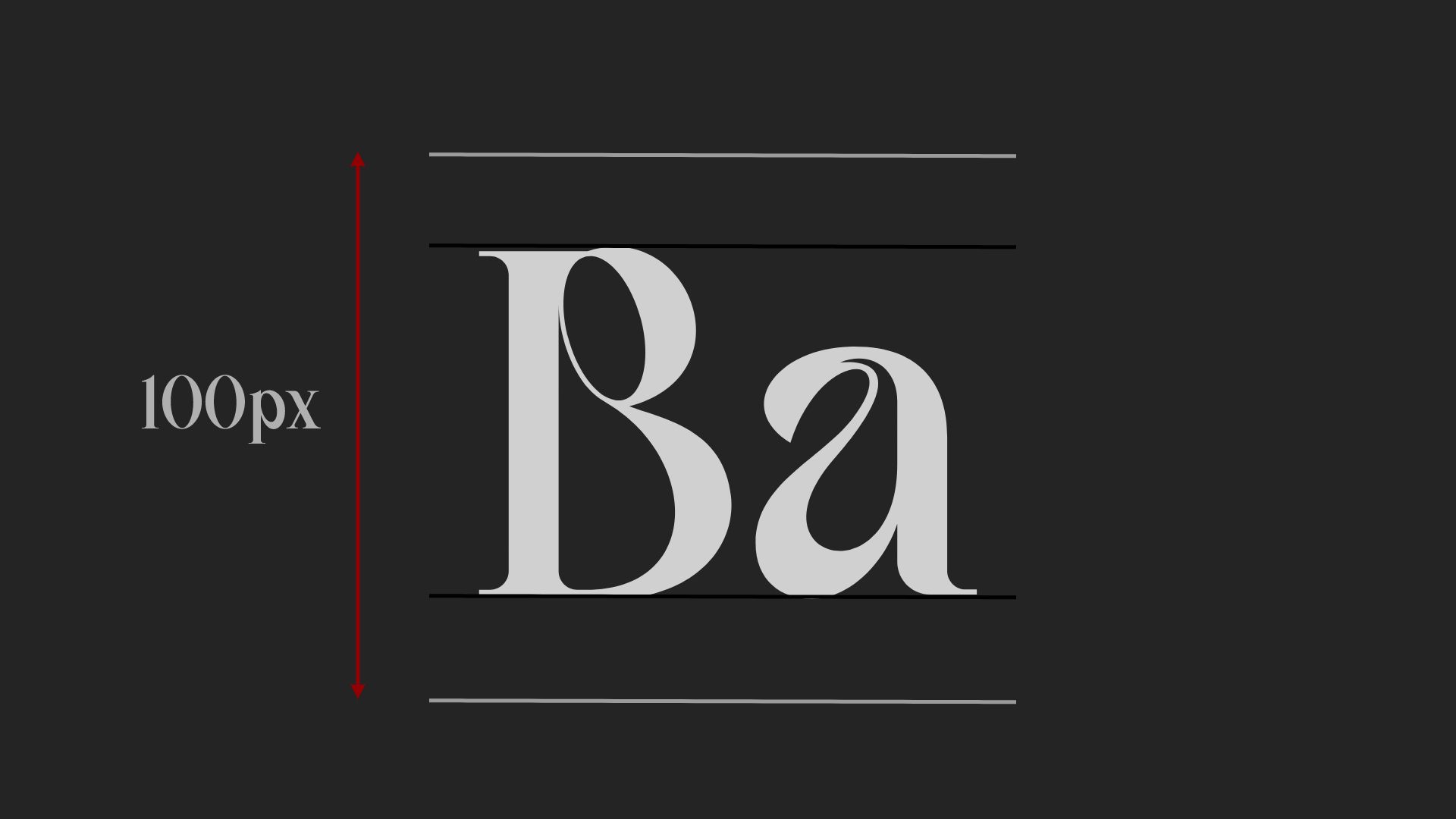
By doing that, what you are really saying, is that the “box” containing one line of your font (we are going to call it the “content box”) needs to be a 100px high.
Now, the problem is that the font inside the content box don’t touch the top and bottom border of it. And most importantly, this gap between the font and the content box top and bottom is variable between each font.
Let’s see an example to make it clear for everyone:
But why is it a major issue?
NimbusCSS is based on one fundamental principle: the harmony.
Everything is calculated based on harmonic scale (the font-size, the gaps, the paddings...). But how can we space the text harmoniously, if we don’t know the spacing between the font and the content box?
The best way to deal with this problem is to go from this:
To this:
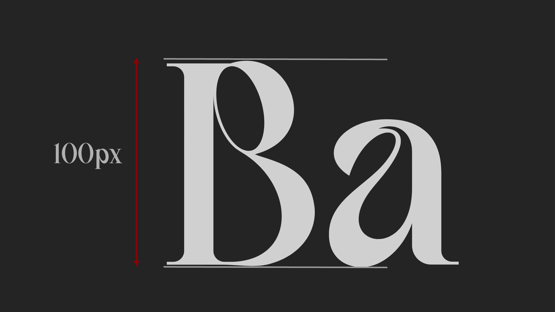
To do so, we first needed to give to the font it’s real height (so that, in this example, 100px represent the height of a capital letter):
But now, we are left with an enormous content box.
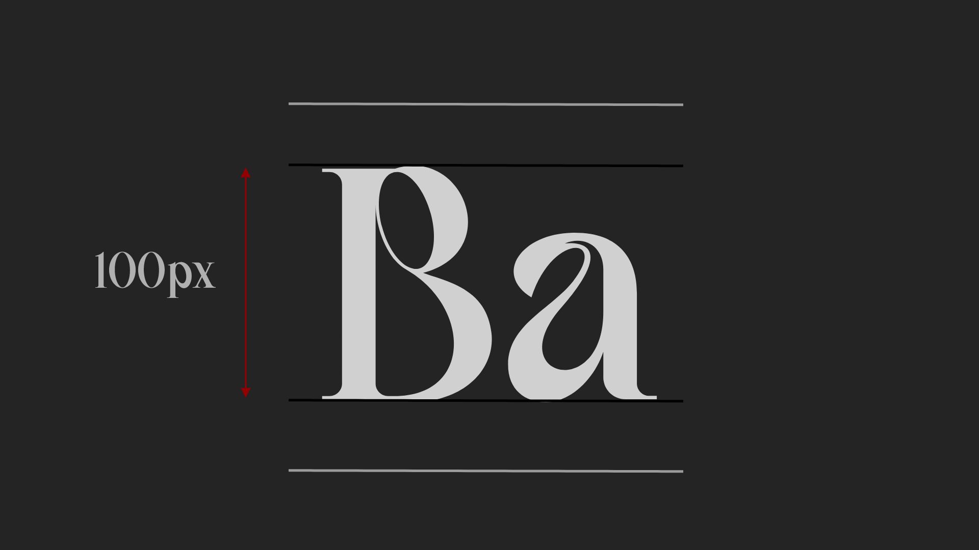
The best way to deal with that, was to create a before and after pseudo element, with margin top and margin bottom in order to delete this gap:
Now our font looks perfect, and we can give it a harmonic line gap. It will fit perfectly one our page.
But one major problem remains:
This is what our font looks like on Linux/Mac:
This is what our font looks like on windows:
Now why is that?
This is due to the way that OS calculates the fonts.
Linux and mac use font metrics called Hhea. And window use the OS/2 Win font metrics.
Those 2 kinds of values are really different and unproportional:
Bagerich:
Hhea:
- ascender: 750
- descender: -240
OS/2 win:
- ascender: 1049
- descender: 224
Kawoszeh:
Hhea:
- ascender: 1018
- descender: -260
OS/2 win:
- ascender: 1018
- descender: 260
In order to manage this problem, we created a converter that will configure your font to be calculated by windows based on OS/2 Typo, which are metrics understood by windows, and equal to Hhea. And this converter also changes your font to OTF format.
Now your font is the right size, adapts perfectly to your page on any OS or browser, and you keep intact the harmonic of your page.